E-Commerce
How to create an ideal checkout page for your eCommerce
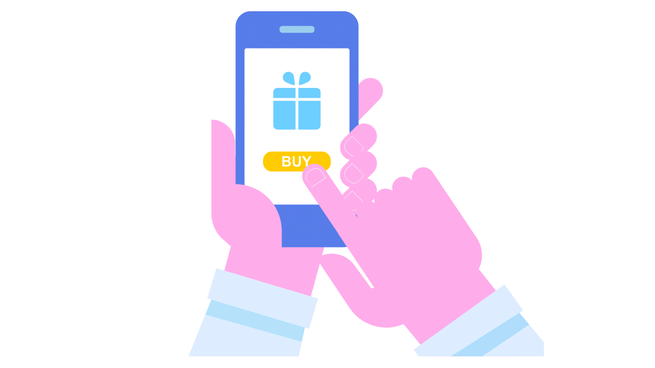
Checkout Page
Within electronic commerce, the abandonment of shopping carts in the middle of the process is a problem that generates many losses. It is estimated that 69.23% of users who add products to their basket, withdraw before concluding
It is a fact that these people did have the intention of buying or at least were attracted to the product; So why is it that they abandon the cart before closing the sale? Mainly it is because they get confused or distracted during the checkout process, also because there are charges for shipments that they did not have or for failures and slowness on the site.
It is important that during the checkout the process is fast, efficient, and without distractions. Follow the following recommendations to achieve this:
1. Implement a simple design
The elements within the checkout page should be only as necessary. At this point, the only interest is that the customer makes the purchase. Any misplaced information, such as ads or pop-ups, can distract your attention and go elsewhere.
2. Don’t force subscriptions
Try not to overwhelm users with the need to create an account, many people will leave if you do. Your interest is that they make the purchase, later on, the thank you page you can invite them to register to receive more benefits.
3. Implement security certificates
The first thing is to activate the https protocol, which indicates to the user that they are browsing in a secure environment and that their data cannot be intercepted.
The second is to acquire a trusted certificate with a specialist company that -after evaluating that the site complies with certainly required protocols- delivers a logo or insignia that you can place on the site, such as a “guaranteed” seal or a padlock that Although they do not represent any real guarantee, they generate trust in users and encourage them to continue with the purchase.
4. Reduce steps
It is necessary that the customer reaches the checkout page in a few steps before interest is lost. Eliminate any unnecessary instances and focus on finishing the process as soon as possible.
5. Use clear action buttons
To avoid the user being confused, pay special attention to the size, color, and font of the buttons to buy or continue with the process. It should be clear to the user how to proceed.
6. Solve the frequent doubts
Avoid even having to ask. Be clear about the cost of shipments, inform the time it will take for the customer to receive their order and the return policy. This will increase customer confidence.
You can also offer the option of solving queries online, with a help chat or special contact telephone number.
7. Improve the speed and usability of the site
Users don’t usually wait. The speed of e-commerce is a key factor in preventing customers from abandoning you: a delay of 2 seconds is enough for 20% of them to decide to leave and not complete the sale. In the same way, your site must be designed to adapt to mobile devices, especially if we consider that 51% of the time that people spend online they do so through their smartphone.
8. Offers various payment methods
Perhaps the customer still feels insecure with some online transactions and does not want to enter their credit card information, so you should offer other options such as bank deposit, transfer, or Paypal.
http://www.cnet.com/uk/news/whats-behind-the-ny-bills-to-ban-anonymous-online-comments/
Better user experience with a functional checkout page will translate into more conversions, sales, and satisfied customers.

 France FR3 years ago
Game of Thrones Saison 8 episode 5 streaming VOSTFR

 Education2 years ago
Does CBD work as a sleep aid? and its Disorders

 Finance4 years ago
WeTransfer Alternatives (based on Outlook and OneDrive) for big file transfers
 Credit Card4 years ago
KELISTO: How Can I Get Free Credit Card?

 Education2 years ago
Can Cannabis Cause You to Grind Your Teeth? [Explained]
 Featured4 years ago
PERSONAL INCOME TAX. VARIATIONS IN PERSONAL INCOME TAX

 Business2 years ago
Use of Technology in Education for Learning and Teaching
 Finance4 years ago
3 Best Financial Tips